S T O R Y
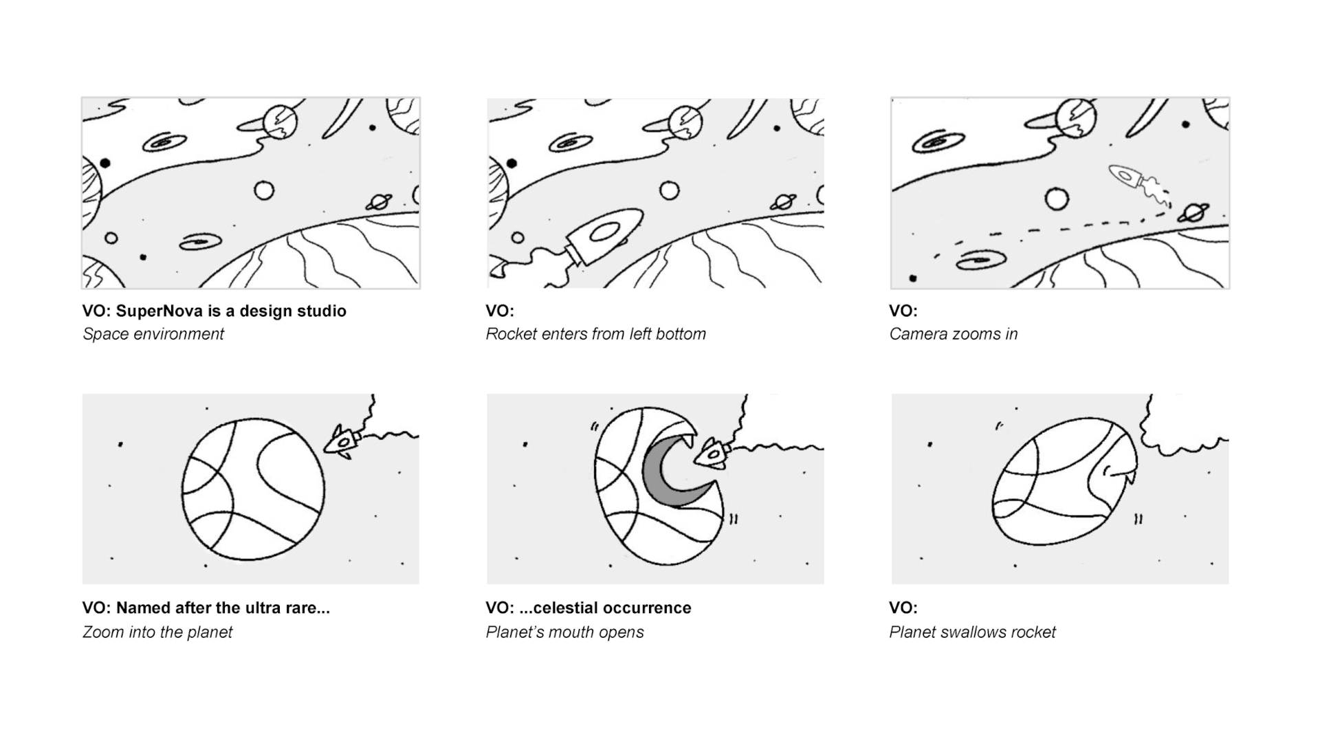
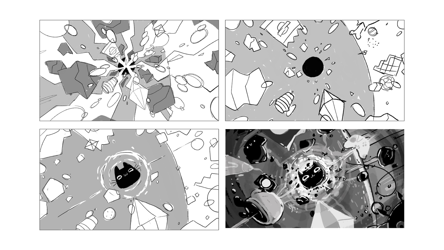
When thinking of the best way to represent the essence of our collective, we decided to start in outer space…
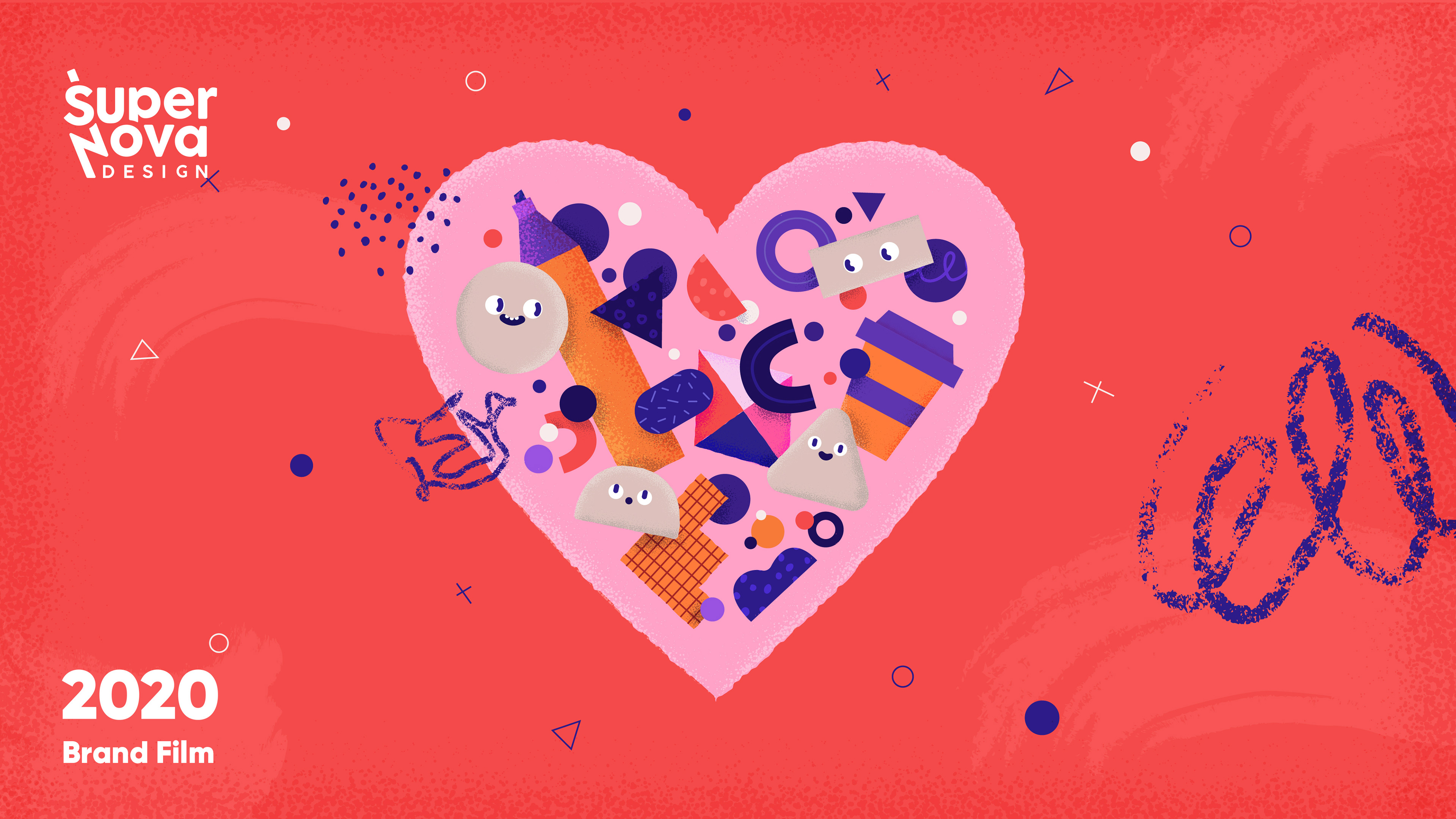
We decided on the name Supernova because the energy generated from this beautiful luminous stellar explosion felt synonymous with bolts of inspiration during the creative process. Looking at characters as extensions of ourselves, I wanted to build a narrative around who we are, how we work and the kind of relationships we want to build with our clients & collaborators.
V I S U A L D E V E L O P M E N T
Characters & Colors
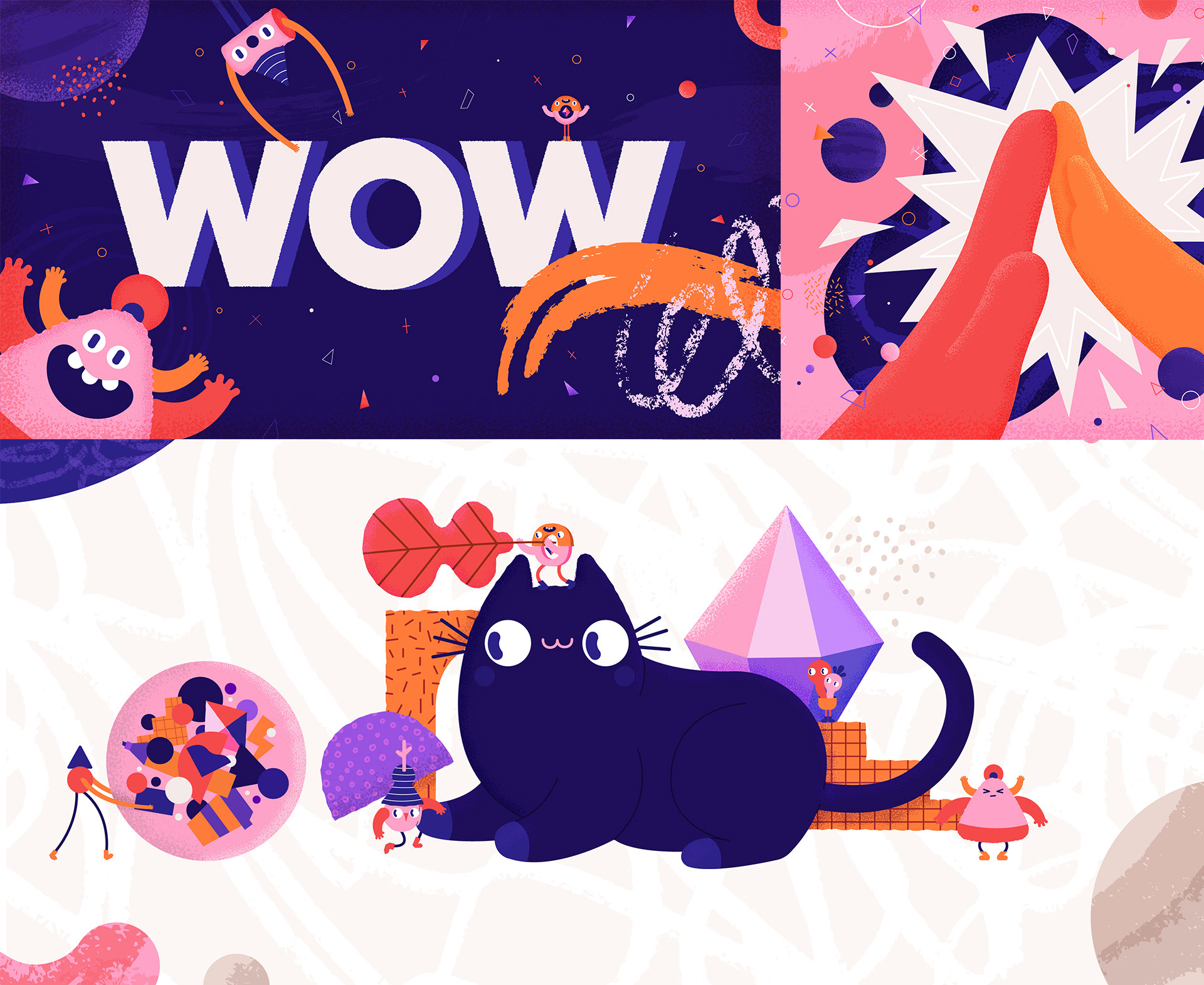
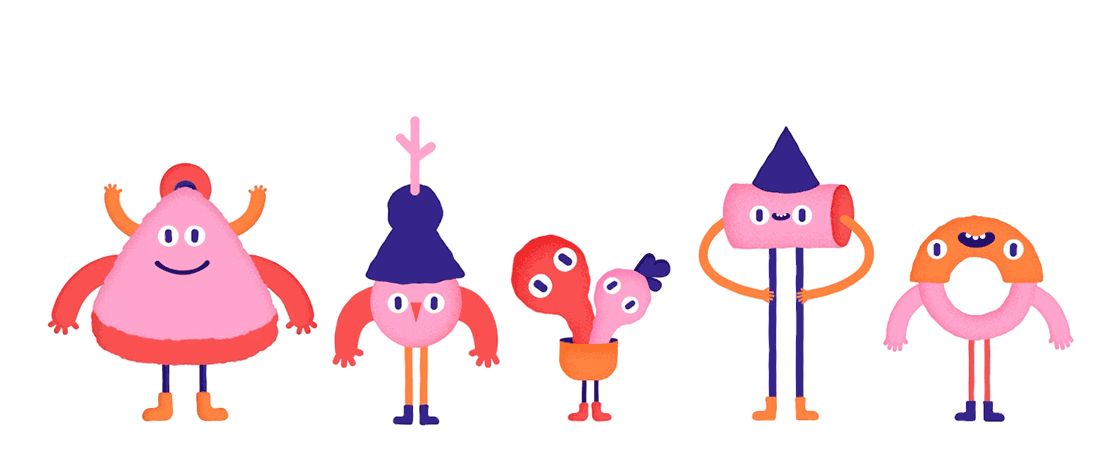
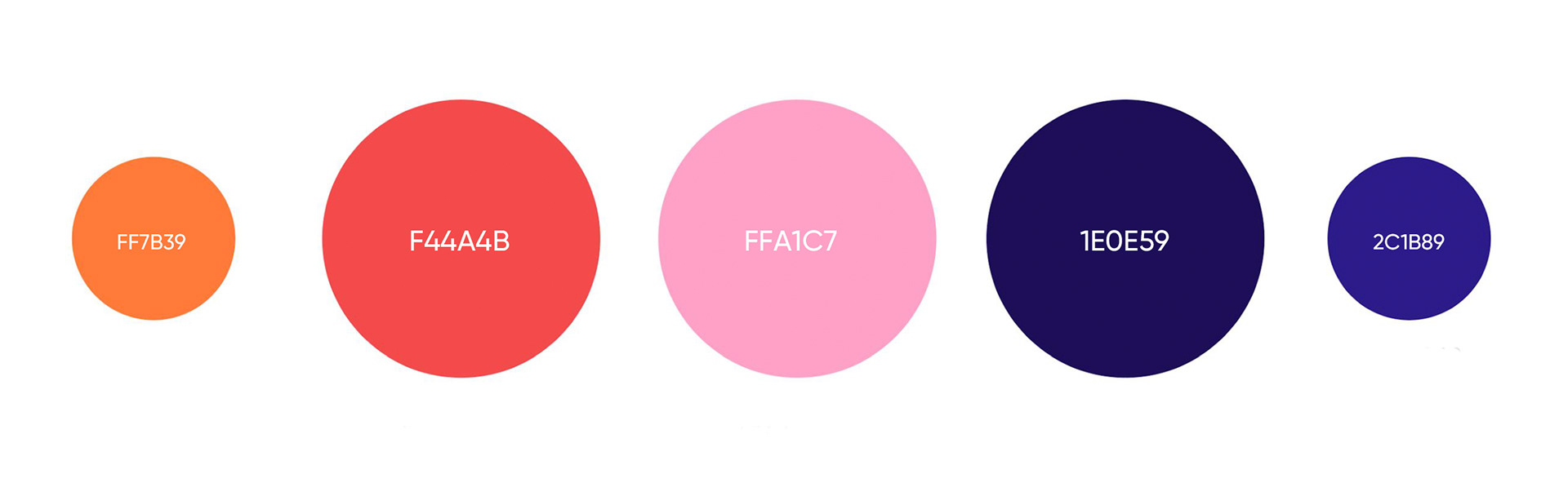
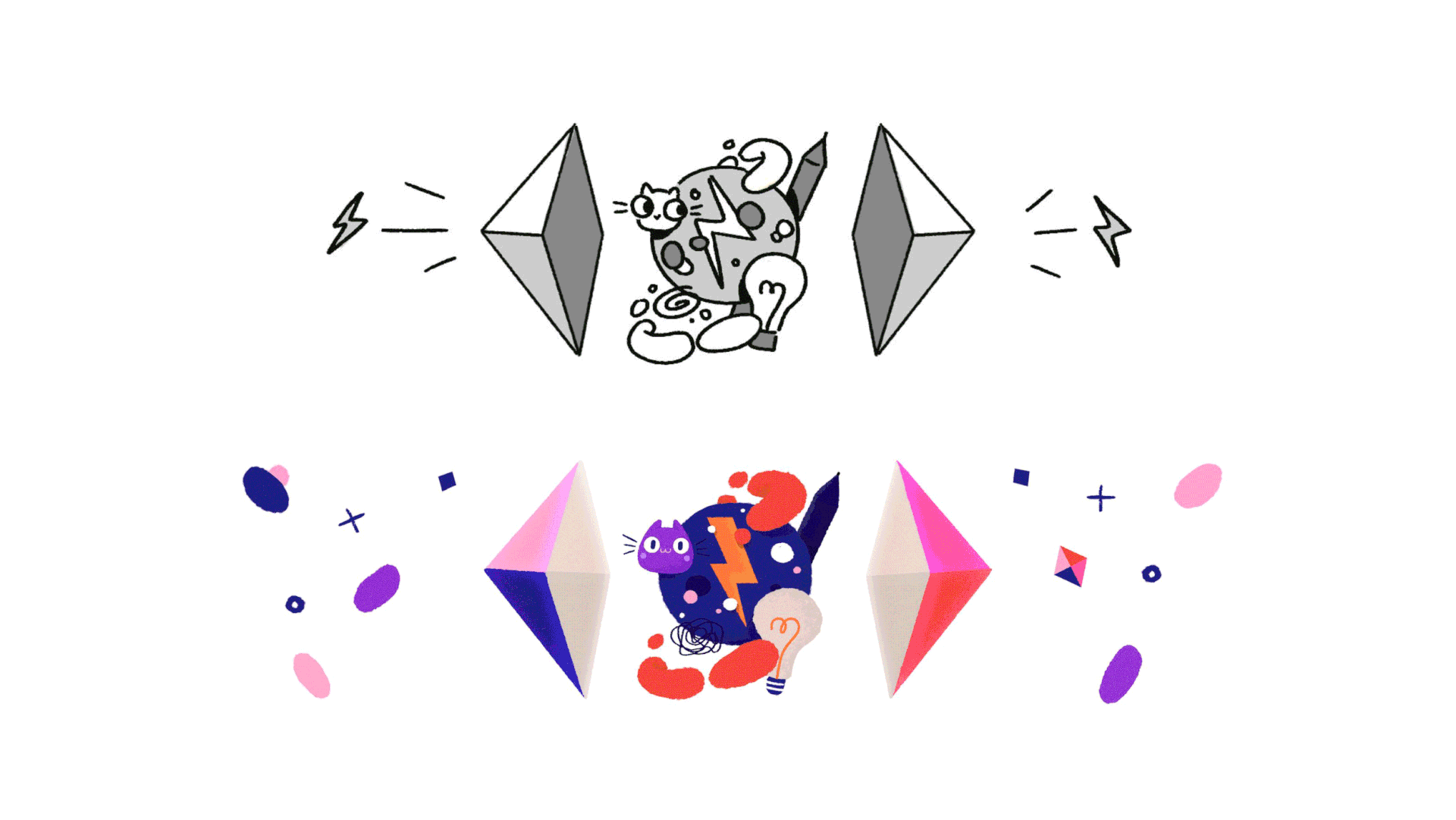
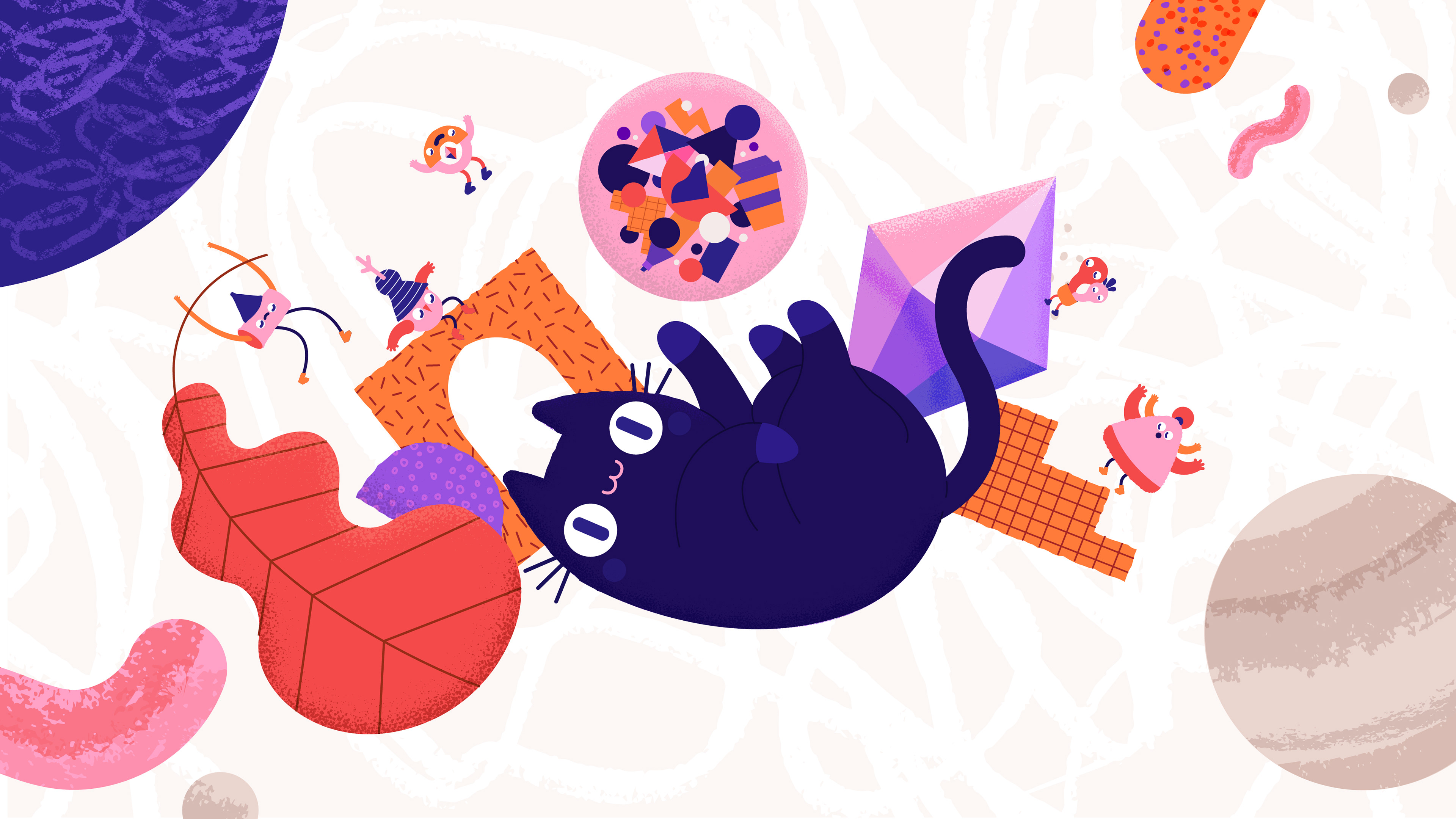
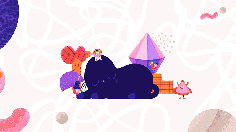
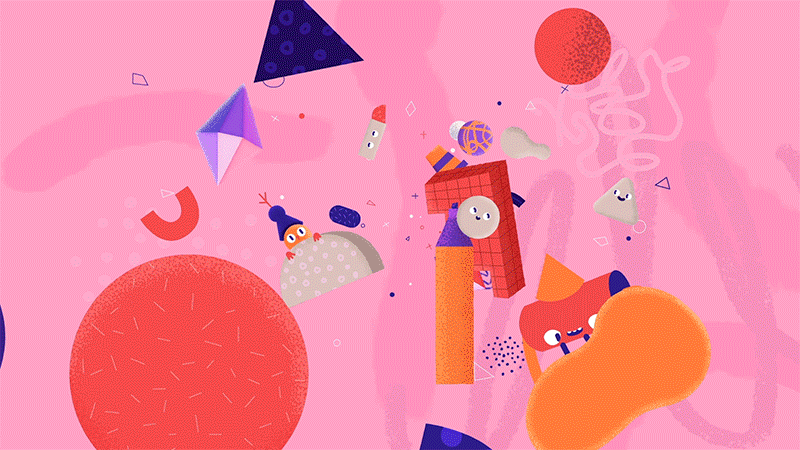
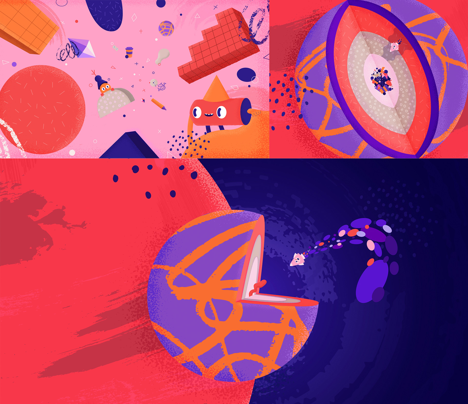
Following the moodboards, we created some explorations to land on a style that had simple shapes but contained organic textures. We started with developing an assorted set of characters which were based on simple primitive shapes and whose form language eventually informed the development of other elements in the brand film. We also wanted to keep the color palette limited to the five brand colors we had chosen to represent Supernova.
V I S U A L D E V E L O P M E N T
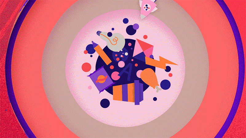
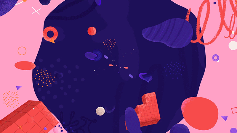
Design
We explored a lot of different variants based on our design parameters and initial concept and explored ideas about what would exist at the core of the planet. We decided to base those elements on what fuels us as creatives and sometimes physical representations of things we are most passionate about adorn our workspaces and creative environments.
THANK YOU! 🧡
-
My roles:
Animation
Animation